The Dashboard app in Simply CRM allows you to generate reports about your customer’s activities, sales processes or sales performances and revenue.
Important: All new instances of Simply CRM come with the latest version of the Dashboard app. On older instances, the app needs to be installed manually.
With reports and dashboards, your team can extract the most valuable data and gain in-depth insight into the workings of each department in the company. From customer support to marketing and sales, everyone can use Simply CRM to create their own overviews and track the key metrics.
Aside from custom widgets, the Dashboard module also offers three types of reports: detailed reports, charts and pivots.
Detailed reports provide you with a table overview of your data, while charts generate a visual representation of your records based on your criteria.
Pivot reports are condensed overviews that summarize large amounts of data to provide your team with a summary that’ll help you quickly analyze your data. For example, you can use pivot reports to show the number of opportunities at each sales stage for each of your salespeople.
Before we focus on each type of reports in greater detail, let’s first explain how you can install the Dashboard module in your instance of Simply CRM.
How to activate the Dashboard app
If you’re unsure how to install the Dashboard app in Simply CRM, please consult our guide on activating apps in the Simply App Store.
Important: If you’re an existing user, your instance may also contain the Reports module, an early version of the current app. If you want to create custom dashboards, make sure to use the Dashboard app. The old app does not support dashboards.
If you do not have access to the Dashboard app in your instance, please contact our support team through email or LiveChat. We will install the app for you, free of charge.
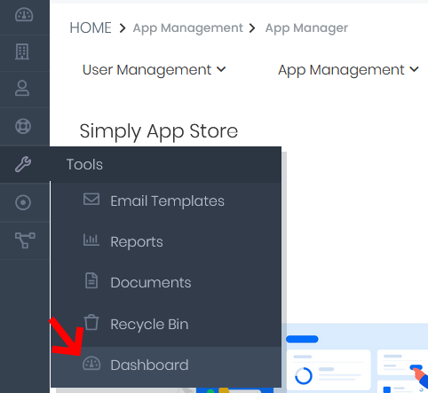
Once you activate the app, it will become active in your instance and you’ll be able to access it from the Tools tab on the sidebar menu. Just click on Dashboard to view the app and its settings.
How to create detailed reports
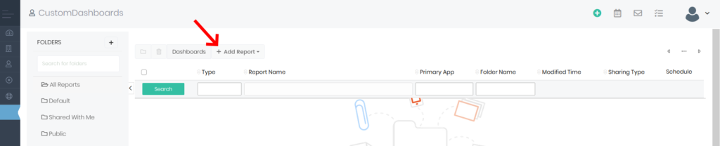
When you open the Dashboard app, you’ll be able to create custom reports and pin them as widgets on the dashboard page.
To create a new report, click the New Report button in the top left corner of the app’s homepage.
From the drop-down, select the type of report that you want to create. As mentioned earlier, you can choose between Detail Report, Charts and Pivot here.
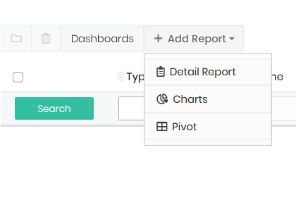
The creation process is similar for all types of reports. Pivot and Chart reports only require you to enter additional information for the chart in the end.
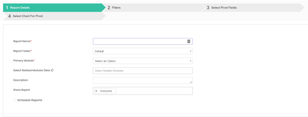
Regardless of the type of report that you select, you’ll first need to enter the report details, as shown below.
Report details
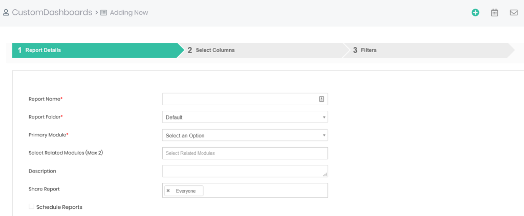
Here, the mandatory fields are marked with a red asterisk. In order to proceed with the report, you’ll need to enter data in the following fields: Report Name, Report Folder and Primary Module.
The table below explains what data should be entered in each field.
| Field Name | Description |
| Report Name | Determines the name of the report; shown on the reports overview |
| Report Folder | Specifies the file in which the report will be saved |
| Primary Module | Decides the module that will be associated with the report |
| Select Related Modules (Max 2) | Specifies additional modules that will be related to the report |
| Description | A brief description of the report |
| Share Report | Specifies which users will be able to view and edit the report |
| Schedule Reports | Determines whether the report will be automated and executed in specific time intervals |
When you check the Schedule Report option, you’ll get access to the options shown in the image above. In order to schedule a report, you’ll need to fill out the mandatory fields: At Time and Select Recipients.
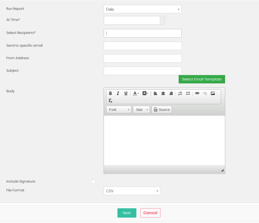
| Field Name | Description |
| Run Report | Sets the report frequency, i.e. how often it will be created |
| At Time | Specifies the exact time of day at which the report will be generated |
| Select Recipients | Determines what users will receive the automated report |
| Send to specific email | Allows you to specify what email addresses will receive the scheduled email reports |
| From Address | Decides what email address will be used to send the report email |
| Subject | Sets the subject of the scheduled report email |
| Body | Determines the content of the scheduled report email |
| Include Signature | Specifies whether or not a signature will be included in the report |
| File Format | Determines the format for the report file |
Report columns
When you configure the report details, press the Next button at the bottom of the page to move on to the Report Columns section.
Based on the modules you selected in the previous step, you’ll now be able to choose what columns will be shown in the report, how the data will be grouped, the order of the column data, and the calculations that will be done with the available data.
| Field Name | Description |
| Select Columns | Allows you to choose the columns that will be shown in the report |
| Group By | Decides how the columns will be grouped |
| Sort Order | Sets the order (ascending or descending) of records within the grouped columns |
| Calculations | Specifies what calculations will be performed within the report |
To illustrate how the reports work, we’ll select the columns Contact First Name, Contact Last Name, Invoice Total and Invoice Date. We’ll group the data by Invoice Date.
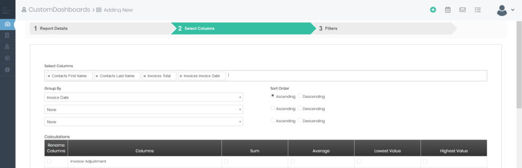
This way, we’ll create a report that lets us see how much our clients spent on invoices in specific time periods. In the Calculations table, we’ll check the boxes in the Sum and Average columns. By doing this, we’ll see the sum of all invoices and the average value of the invoices associated with a specific contact record.
You can configure the columns and the data that will be displayed in them however you want. You have complete freedom over what data your reports will show.
Report filters
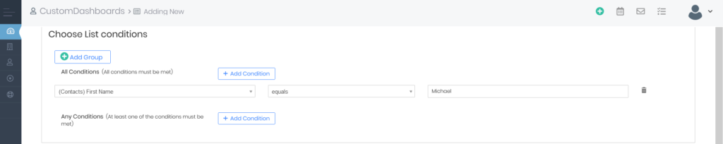
When you finish setting up columns for the report, you can press Next to move on to the Filters section. Filters allow you to further sort through your data and select only the key records that you need.
When filtering data, you can choose whether to display the data that satisfies all the specified criteria (All Conditions) or to showcase all the data that meets at least one condition (Any Conditions).
If you do not wish to filter the data in your instance of Simply CRM, you can skip this step and press the Save & Generate Reportbutton at the bottom of the screen.
However, to illustrate how the filters work, we’ll set a condition that will only show us the data related to Contacts records whose first name is Michael.
When we press the Save & Generate Report button, we’ll create the following Detail Report.
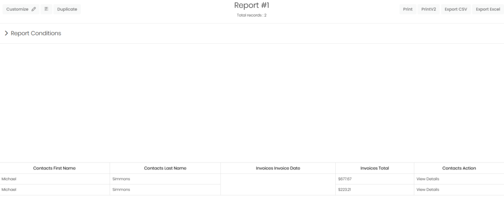
As you can see the report only contains the contacts whose first name is set to Michael. The Invoice Due Date column appears empty, because our invoices do not have any due date configured.
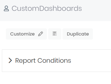
In the top left corner, you can customize the report, add it to a dashboard or create a copy of it.
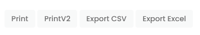
In the top right corner, we have the options to Print, Export CSV or Export Excel in case we need to use the report outside of Simply CRM.
How to create chart reports
When you’re creating a chart report, the creation process starts the same. You first need to enter the basic report information and set up filters before moving on to conditions. With charts, you do not need to configure the report columns, but you need to select the chart type and its fields.
Simply CRM currently offers pie charts, doughnut charts, vertical bar charts, horizontal bar charts, line charts, stocked charts, funnel charts and bar funnel charts, as shown in the image below.
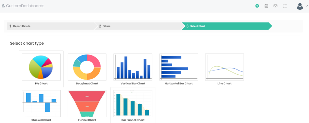
Once you select the chart type, you’ll need to choose the data that will be shown in your chart.
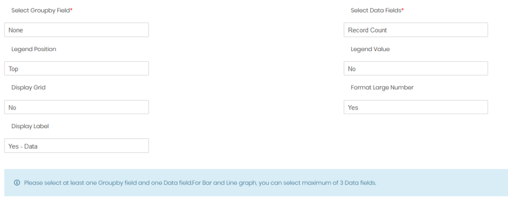
You’re required to fill out the Select GroupBy Field and the Select Data Fields sections here. All other fields are optional and only affect the peripherals of the chart.
The following table covers all the fields in chart reports.
| Field Name | Description |
| Select GroupBy Field | Specifies the field that will be used to group the data in the chart |
| Select Data Fields | Selects what fields will be shown in the chart |
| Legend Position | Specifies the position of the chart legend |
| Legend Value | Specifies the values that will be shown in the legend: values, percentages, or both |
| Display Grid | Determines whether the chart will have a background grid |
| Format Large Number | Decides how the large numbers will be formatted in the chart |
| Display Label | Allows you to display or hide labels within the chart |
When you finish configuring the chart, press Save & Generate Report.
In our example, we used First Name as the group by field and Record Count as the data fields in the chart. Therefore, we’ve created a chart that counts how many times each name appears in the Contacts module, as can be seen below.
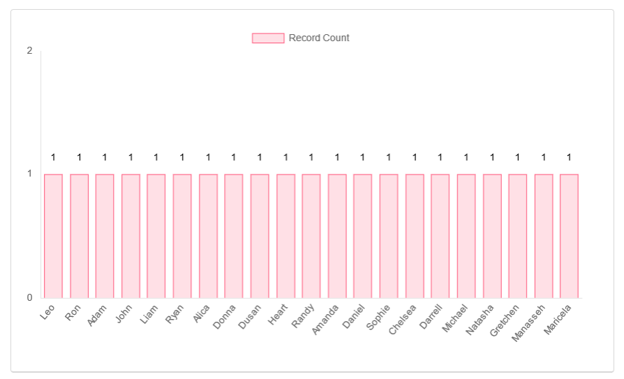
Similar to Detail Reports, charts offer you several options once you generate a report. In the top left corner, you can customize the report, add it to a dashboard or duplicate it.
In the upper right corner, you have the options to print or export the chart in PDF format.
How to create pivot reports
Pivot reports start out the same as other types of reports.
In the first step, you need to enter the basic report information, such as its name, folder, modules, etc.
Next, you’re prompted to configure the report filters. This step is identical in all reports.
After you set your filters, you’ll be required to select the pivot fields for your report. You’ll need to enter your row fields, column fields and data fields, as shown below.
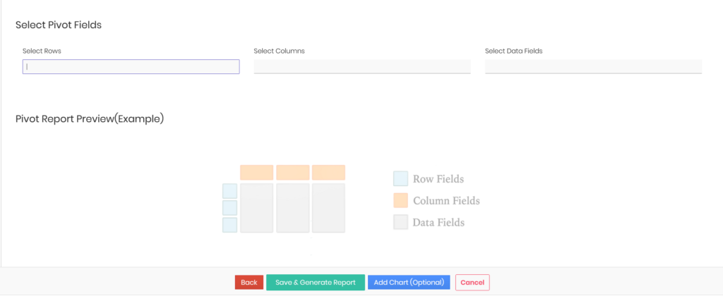
| Field Name | Description |
| Select Rows | Specifies the data points will be set as the table rows |
| Select Columns | Sets the columns of the pivot table |
| Select Data Fields | Determines what data will be shown in the body of the pivot table |
To illustrate how pivot tables work, we’ll set the following criteria: Last Name under Select Rows, Deals Sales Stage in the Select Columns field and Amount (SUM) for the Select Data Fields section.
This pivot report shows us the sum of all deals in each sales stage for each salesperson (Last Name) on the team.
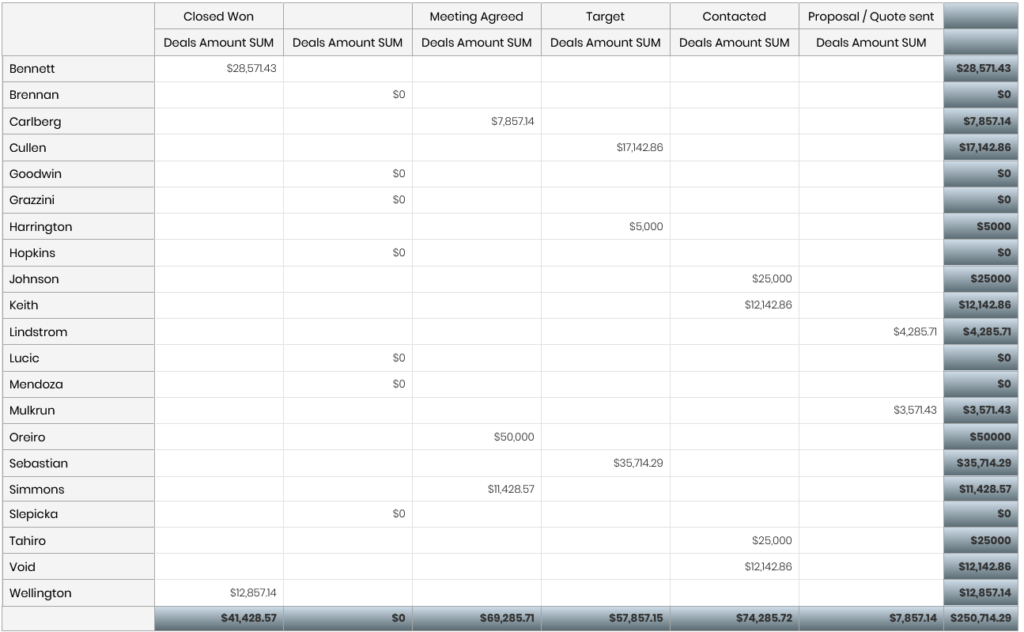
If you wish to add more information to the pivot table (such as the first name of each salesperson), you can simply select more fields under the options Select Rows, Select Columns or Select Data Fields.
Similar to other reports, you can customize pivot tables, add them to dashboards or duplicate them. You can only export pivot reports to Excel.
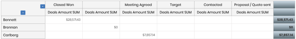
Pivot tables are more flexible than other types of reports as they allow you to expand or collapse fields to create a more compact overview or even add a chart to them to better visualize the data.
You can expand or collapse the fields by hovering over them and pressing the plus (expand) or minus icon (collapse) next to them.
How to create dashboards
In Simply CRM, dashboards act like a clean canvas that allows you to create a quick overview of your company’s most important information.
On dashboards, you can add charts, pivot tables or detailed reports with records filtered to suit all of your organization’s needs.
To access dashboards, you’ll need to open the Dashboard app from the Tools tab on the left sidebar.

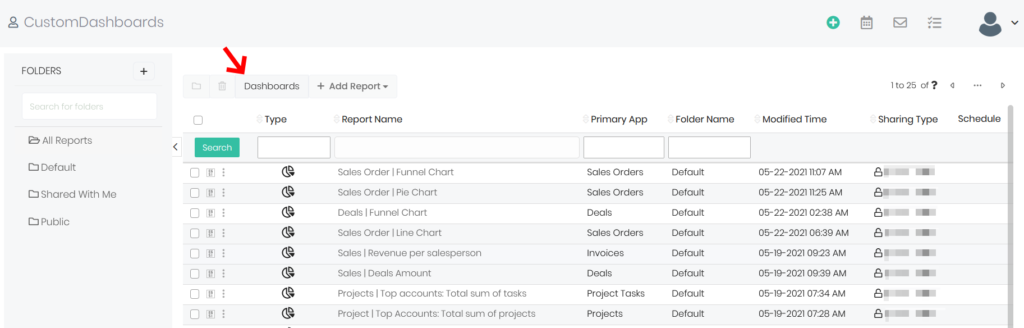
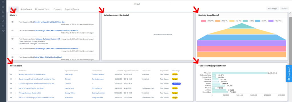
The Dashboard app shows the list view of all reports in your system. To navigate to the dashboard section, click the Dashboards tab in the top left corner.
When you press Dashboards, you’ll see the demo version of your active dashboard.
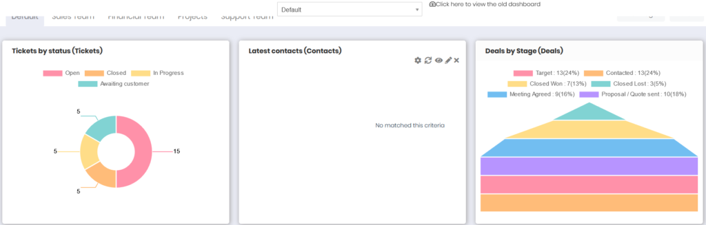
The Dashboard app is divided into three sections: boards, tabs and widgets.
Widgets
Widgets are shown as cards on the dashboard and they contain charts or reports that present you with a graphical of your company’s data. For example, the following image shows five different cards within the Default dashboard.
Widgets provide you with three options:
- Add Widget – allows you to create a new widget on your dashboard
- Edit Widget – allows you to customize an existing widget
- Dynamic Filter – allows you to set a filter that will automatically be applied and present you with only the data that you want to see on your dashboard
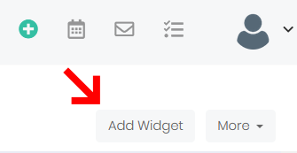
If you wish to add a new widget, click the Add Widget button in the top right corner.
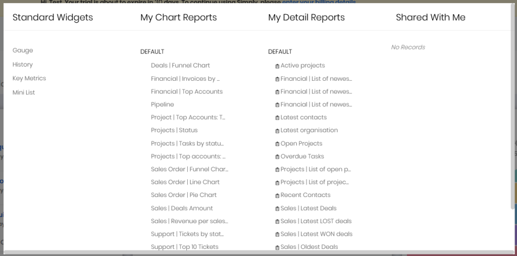
In the resulting pop-up window, you can select what report will be shown or use one of the built-in widgets.
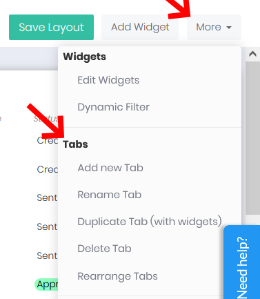
Once you add a widget to your board, you can edit its shape and size by pressing the More button and selecting Edit Widgets.
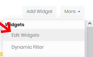
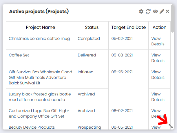
The Edit Widgets option will become visible in the bottom right corner of all widgets within your board. It’s shown as a double-sided arrow which you can click to reshape and resize the selected widget.
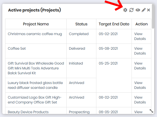
In the top right corner, you’ll see a few more widget options. You can reconfigure the widget settings, refresh the widget data, access a full-screen view of the widget, edit the report shown in the widget, or remove the widget from the dashboard.
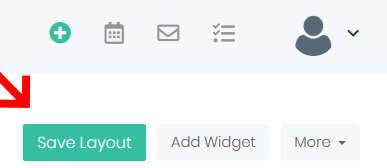
When you finish editing widgets, make sure to click the Save Layout button in the top right corner to confirm the changes.
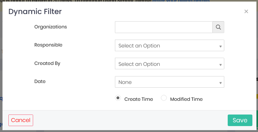
The final option is Dynamic Filter and it allows you to filter the data in the widgets using one of the following criteria:
- Organizations
- Responsible
- Created by
- Date
- Create Time or Modified Time
Tabs
Aside from widgets, each dashboard can also contain multiple tabs that act as separate pages with their own widgets.
You’ll find the tabs at the top of the Dashboard app.
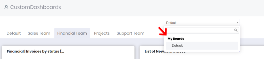
For example, the Default dashboard contains the following tabs: Default, Sales Team, Financial Team, Projects, Support Team.
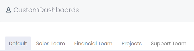
You can use tabs to organize the data within each department and create a better overview of each department’s key metrics and information.
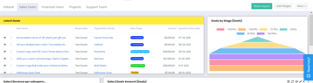
The Sales Team tab contains all the information about the latest deals and negotiations that your sales department is working on.
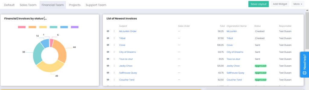
Meanwhile, the Financial Team tab can present you with an overview of all the financial information, such as invoices, payment statuses and revenue figures.
You can edit every widget within each tab, reorganize them and configure what data will be shown depending on your own priorities. You have complete control over the tabs and you can customize each tab however you want.
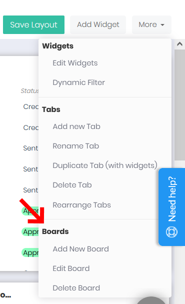
Further, the More section offers a variety of options for tabs:
- Add New Tab – lets you add new tabs to the dashboard
- Rename Tab – allows you to rename an existing tab
- Duplicate Tab (with widgets) – duplicates a tab, together with all of its widgets
- Delete Tab – removes a tab from the dashboard view
- Rearrange Tabs – allows you to switch positions of individual tabs on a dashboard.
can add new tabs, delete the existing ones, rename or rearrange them, as well as duplicate tabs to quickly create copies of all the widgets within the selected tab.
All of these options can be found under the More button in the top right corner.
Boards
In addition to tabs, you can also create individual boards within your Dashboard app. A separate board acts as a brand new dashboard with its own tabs and widgets.
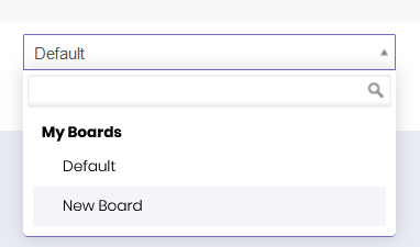
When you open the Dashboard app, you’ll only have the Default board available, as shown in the image below.
To add a new board, edit or delete an existing one, click on the More button in the top right corner. The drop-down menu will reveal all the available options:
- Add New Board – allows you to create a new board within the dashboard
- Edit Board – allows you to customize an existing board
- Delete Board – allows you to permanently remove a board from the dashboard.
Once you create a new board, you’ll be able to switch between the boards using the centered drop-down menu with the name of the current board.
If you need any help installing or configuring the Dashboard app, please don’t hesitate to send us a message at support@simply-crm.com. Our team will be happy to assist you.


